TLDR - WingJockey METARs have winds visualized over the airport diagram, along with best runways and crosswinds. The new iOS Home Screen widget provides instant access to this info without needing to dig in an app.
WingJockey is a labor of love - a love of aviation and a love of building cool things with data. And what type of data do pilots grapple with most? Weather data.
Learning the language of METARs is a rite-of-passage for pilots. We've all been hit with obscure abbreviations by our instructors or DPEs who love to bewilder us with rare weather events.
Remembering abbreviations is one thing. But applying the METARs current winds to your airport is a whole different animal. Which runway has the best headwind? Is there a left or right crosswind and what's the component? This requires an E6B Flight computer, an uncanny memory of high school trigonometry, or digging up the airport in ForeFlight. All of these methods are clunky.
Now, WingJockey is a digital flight club. It's not a flight planning app or a replacement for aviationweather.gov. But staying aware of the current weather at your home airport is still important. So we were eager to incorporate METARs and TAFs somewhere.
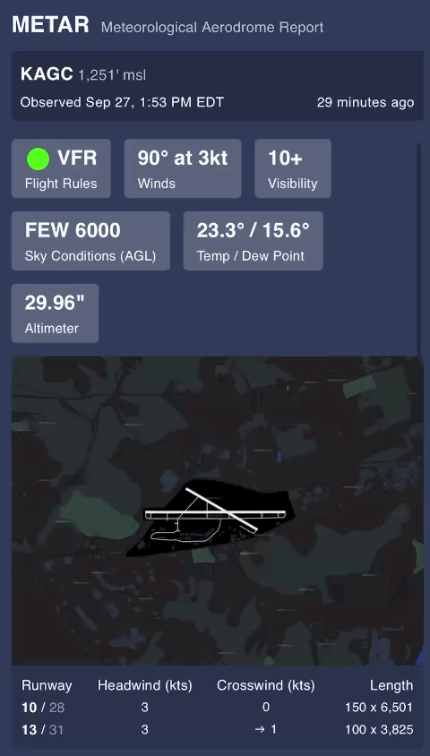
On the field, the windsock gives us a great visual of what's happening with the wind. So rather than just outputting numbers, how can we actually show what the winds are doing just like the sock?
This led us to the WingJockey METAR - an enhanced, but succinct view of the latest weather. The key addition is a visualization of the wind direction and speed overlaid on the airport diagram. Runways are included with the best direction highlighted in bold along with headwind and crosswind components.
Within the WingJockey app, your home airport's METAR and TAF are just a swipe down and a swipe left on the home tab. But you still have to go looking for it.
To bring the info front and center, we built a Home Screen widget for iOS. It auto updates with the latest weather throughout the day.
Unfortunately iOS Widgets don't allow for animation (unless you're the iOS clock widget - c’mon Apple!). But we can still create a subtle visual effect with wind particles that make it much easier to understand the numbers.
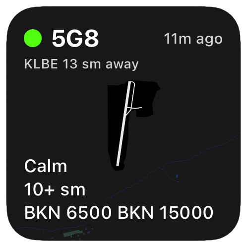
The widget comes in three sizes.
The small widget is a good option for showing the most important info on already crowded home screens.
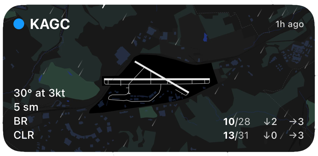
The medium widget adds the runways and winds. It's great for most GA airports.sm
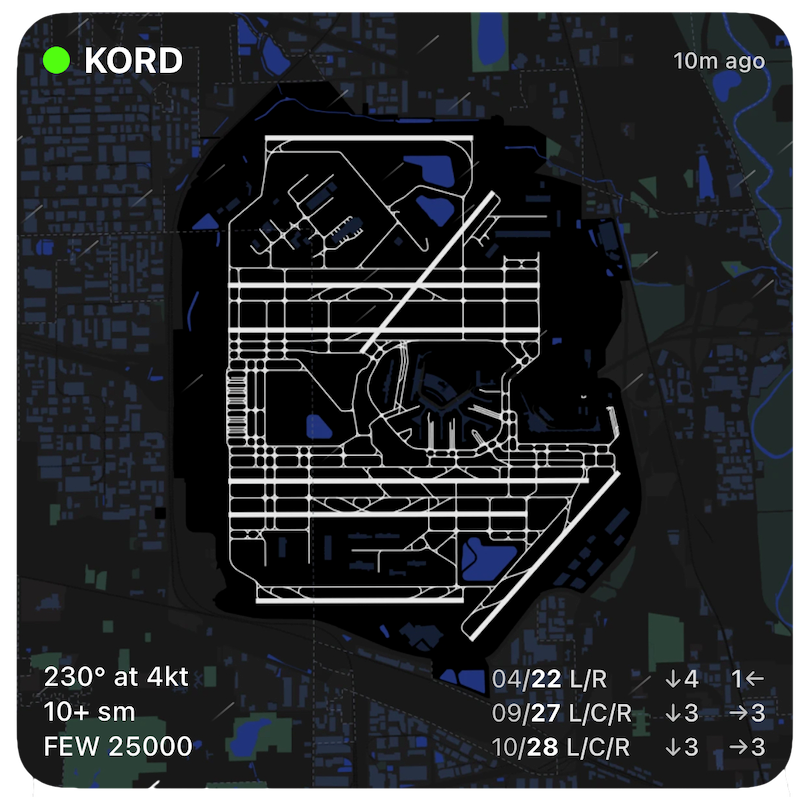
But some airports require more real estate - both on and off screen. Take Chicago O’Hare, with a whopping eight runways.
Keep in mind - iOS manages the update cycle for widgets depending on your phone's available resources. So be sure to glance at the time since the update. Launching WingJockey will also refresh the widget.